|
Back to Blog
Week 4 - Strawberry Ice cream3/16/2022  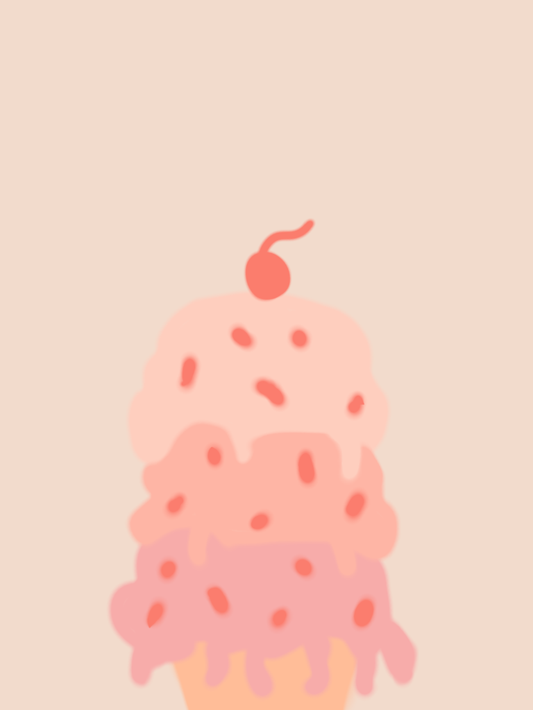 This week, the color palette that I used today were different shades of pink. When I first saw this color palette, I thought of doing strawberry ice cream because I thought it matches the color scheme really well. How I started it off was I used the pink shades that I liked for the ice cream scoops. I then stacked all three of them on top of each other and made them look like they were melting. For the color that looked sort of orange, I made it the cone and placed it underneath the ice cream scoops. I might of made the cone a bit too small because it kind of looks hard to see, but it looks good with the ice cream scoops. To make the ice cream have more detail and for it to look more better, I decided for the color that has a darker pink to be the sprinkles and the cherry on top. For the final touches, I used the last color that kind of looks like a pale shade of pink for the background. This painting turned out pretty good and I think it looks pretty simple yet still cool.
1 Comment
Matthew Barker
3/21/2022 10:26:02 am
I'm loving the palettes you're choosing! Leave a Reply. |
